html样式
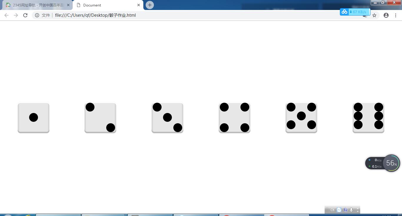
一、二、三这三个点数很容易,div里面有几个点就加几个span。到了四,就需要进行分组。四分两组,五和六分三组
css代码
先写容器骰子的样式
body{ display: flex; justify-content: space-around; align-items: center; } div{ width: 100px; height: 100px; background: #e7e7e7; padding: 4px; box-shadow: inset 0 5px white, inset 0 -5px #bbb, inset 5px 0 #d7d7d7, inset -5px 0 #d7d7d7; border-radius: 10px; } 接下来写点数span的样式,写一、二、三点。##先把骰子的六个面在游览器水平居中排列:六个div,给它们设置相同的样式。同时body要把它转换成弹性盒。让六个div在body弹性盒中,沿着主轴(x轴)自由分配,同时在侧轴(y轴)居中。
span{ width: 30px; height: 30px; background: #000; border-radius: 15px; } div:nth-child(1){ display: flex; justify-content: center; align-items: center; } div:nth-child(2){ display: flex; justify-content: space-between; } div:nth-child(2) span:nth-child(2){ align-self: flex-end; } div:nth-child(3){ display: flex; justify-content: space-between; } div:nth-child(3) span:nth-child(2){ align-self: center; } div:nth-child(3) span:nth-child(3){ align-self: flex-end; } 第四点有两种写法。不论哪一种,article的样式都一样
article{ display: flex; justify-content: space-between;} 第一种
div:nth-child(4){ display: flex; justify-content: space-between;}div:nth-child(4) article{ display: flex; flex-direction: column; justify-content: space-between;} 第二种
div:nth-child(4){ display: flex; flex-direction: column; justify-content: space-between; } 五和六的代码
div:nth-child(5){ display: flex; flex-direction: column; } div:nth-child(5) article:nth-child(2){ justify-content: center; } div:nth-child(6){ display: flex; flex-direction: column; } 最后的效果如下图所示